User Manual
Homepage
The homepage visually illustrates the overall concept of the BCCGMSweb platform. From this page, the user can access other useful pages via the banners located at the top of the page (Figure 1).

Figure 1.
Two banners are available:
Banner 1 provides access to various pages related to the platform. Three links are available, from left to right:
A link to the homepage of the Centre wallon de Recherches Agronomiques (CRA-W). This page opens in a new tab.
A link to the homepage of the BCGMSweb platform.
A link to the homepage of Agromet, the sister platform of BCGMSweb (see the section "Agrometeorology Projects at CRA-W").
Banner 2 is directly linked to the BCGMSweb platform and consists of five sections:
"Indicators": A drop-down menu provides access to three categories of indicators: "Weather", "Remote Sensing", and "Statistics".
"Bulletins": Grants access to all bulletins published since 2002.
"Documentation": Provides detailed definitions of the various proposed indicators as well as access to various resources, including bibliographic references.
"About": Offers a brief description of the philosophy behind the Belgian Crop Growth Monitoring System (B-CGMS), along with information on the service level and the contact person.
"Language Selection": Allows the user to change the language. Currently, four languages are available: the three national languages (French, Dutch, and German) as well as English.
Indicators
(Agro)Meteorological Indicators
The interface consists of various elements (Figure 2).
Element 1 allows users to define the indicator they wish to view. They can choose to visualize either a generic indicator by selecting "all crops" or a crop-specific indicator by selecting "by crop." To facilitate the selection process, a filter based on indicator categories is available, including those related to temperature, precipitation, evapotranspiration, or solar radiation. Depending on the selected indicator, users can also choose the temporal aggregation level, which can be daily, decadal (10-day periods), or monthly. Additionally, within this element, they can specify the target date, decade, month, and year for the selected indicator
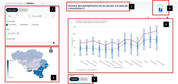
Figure 2.
Element 2 provides a summary of the settings defined in Element 1.
Element 3 allows users to choose whether the indicator value should be displayed as an absolute value or as a relative value, expressed as a percentage compared to the normal calculated over the reference period 1991-2020.
Element 4 displays the selected indicator as a graph for different agricultural regions. The way the data is presented depends on whether or not the user selects a specific agricultural region in Element 5.
If no agricultural region is selected, the display corresponds to the view shown in Figure 2. In this case, the current year is represented by a red dashed line, while the average for the reference period (1991-2020) is shown as a blue dashed line. Light blue bars indicate the full range of values over the reference period, whereas dark blue bars define the limits between the first and third quartiles within this reference period.
If the user selects a region in Element 5 of Figure 2, they will have the option to display either inter-annual variability (Figure 3) or intra-annual variability (Figure 4). The selection of the display mode (inter-annual or intra-annual) is made in Element A of Figures 3 and 4.
To return to the view without selecting a specific agricultural region, the user can click on the selected region again in Element 5 of Figure 2 or click on Element B in Figures 3 and 4.
The inter-annual view (Figure 3) presents the indicator values for all available years in the BCGMSweb database.
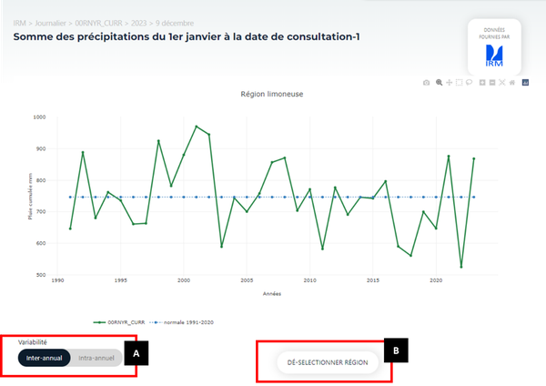
Figure 3
The intra-annual view (Figure 4) illustrates the evolution of the indicator over time for the selected year, from the initial date defined for the indicator up to the selected day, decade, or month as specified in Element 1 of Figure 2.
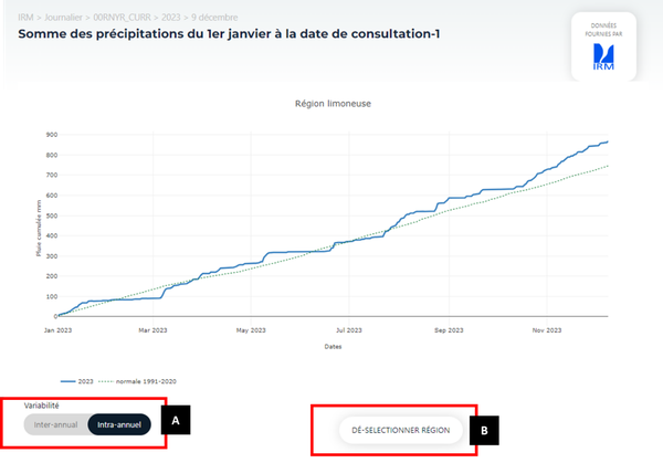
Figure 4.
Element 5 displays a map showing the indicator values by agricultural region, based on the selections made in Element 1. These values are also represented graphically in Element 4 when no specific agricultural region is selected.
By hovering the mouse over an agricultural region (Figure 5), users can view not only the indicator value but also its variability within the selected region. As a reminder, the indicator value for a given agricultural region corresponds to the weighted average of the indicator values from the different 5x5 km grid cells present within that region.
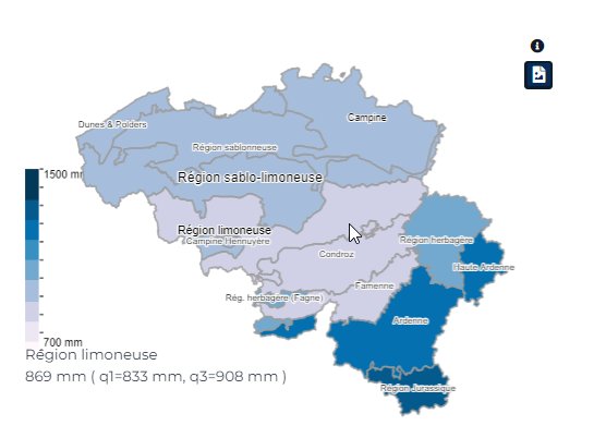
Figure 5.
Element 6 displays the data source.
Remote Sensing Indicators
-----
Statistical Indicators
In principle, the interface for displaying statistical data is quite similar to that used for other indicator categories.
It therefore includes various elements (Figure 6).
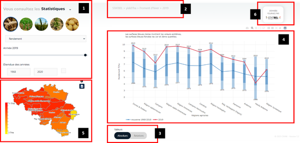
Figure 6
Element 1 allows users to define the parameters of the indicator to be displayed. This configuration includes, from top to bottom:
The selection of the target crop through icons.
The selection of the variable among the three available options: yield, agricultural area, and production (the product of yield and agricultural area).
The selection of the target year, for which the indicator values will be displayed in the graph of Element 4 and on the map in Element 5.
The selection of the period over which the long-term average will be calculated. This long-term average will be displayed in the graphs available in Element 4.
Element 2 provides a summary of the settings defined in Element 1.
Element 3 allows users to choose whether the indicator value should be displayed as an absolute value or as a relative value, expressed as a percentage compared to the long-term average defined in Element 1.
Element 4 displays the indicator values based on the parameters set in Element 1 and the selection made in Element 3. The type of graph displayed depends on whether or not a specific agricultural region is selected on the map available in Element 5.
If no agricultural region is selected, the view corresponds to the one shown in Figure 2. In this case, the selected year is represented by a red dashed line, while the long-term average is represented by a blue dashed line. Light blue bars indicate the full range of values over the reference period, whereas dark blue bars define the limits between the first and third quartiles of the reference period for the long-term average.
If an agricultural region is selected, the graph in Element 4 displays the evolution of the indicator value over the long-term average calculation period defined in Element 1 (Figure 5).
The graph also presents:
The long-term average calculated over the reference period defined in Element 1.
The linear trend calculated over the entire period displayed in the graph.
The quadratic trend calculated over the entire period displayed in the graph.
It is possible to hide one or more of these three curves by clicking on the corresponding label in the legend below the graph.
For both trend lines (linear and quadratic), the platform also provides:
The equation parameters.
The coefficient of determination (R²).
The RMSE (Root Mean Square Error) and RSE (Relative Standard Error).

Figure xx
Element 5 displays a map showing the indicator values by agricultural region, based on the selections made in Element 1. These values are also represented graphically in Element 4 when no specific agricultural region is selected.
By hovering the mouse over an agricultural region (Figure 5), users can view the indicator value for that specific region.
Element 6 displays the data source.